


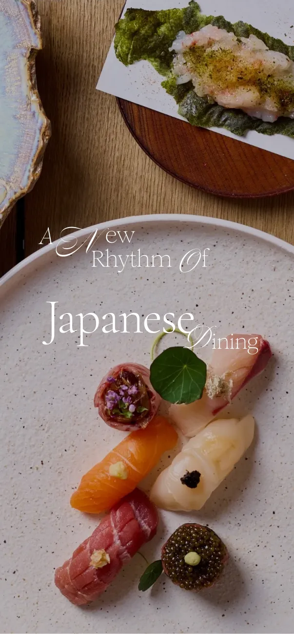
Home | Works | Roketsu | UK-focused website for a Japanese Kappo restaurant.
Built a UK-focused brand site highlighting kappo aesthetics, seasonality, and dining experiences.
Design Overview
Design that conveys the world of kappo
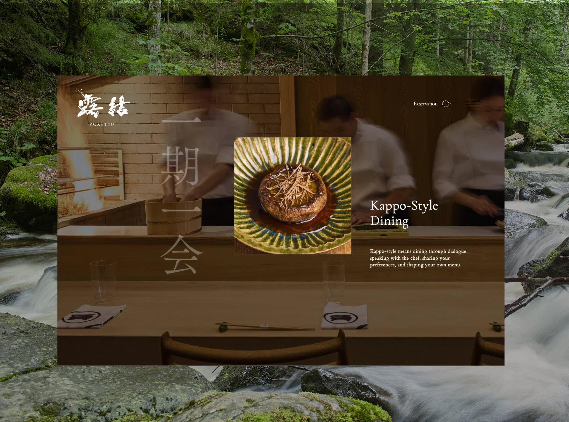
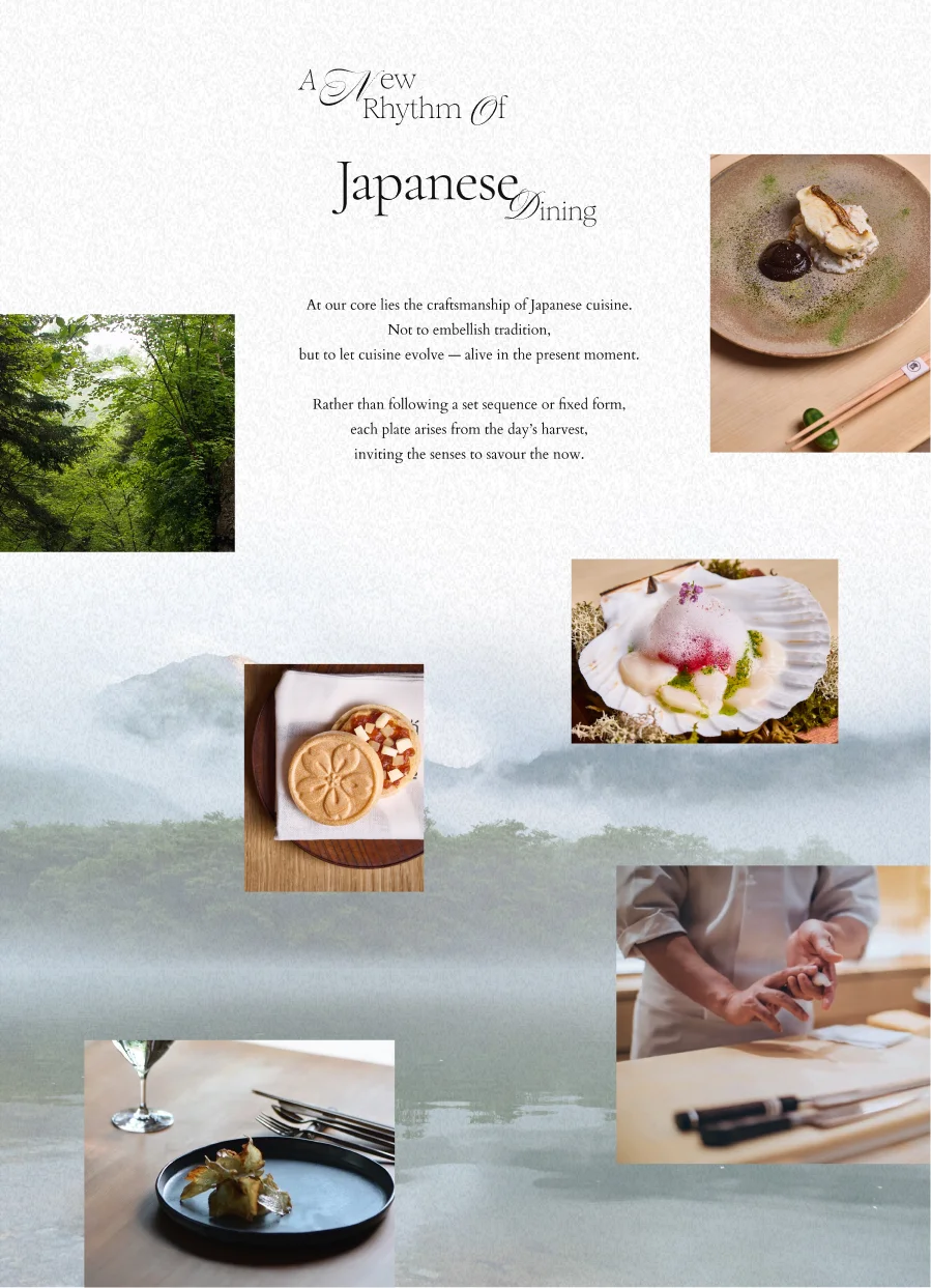
In developing this site, we pursued a design that balances the tension and softness of kappo cuisine, guided by the qualities Roketsu values most: stillness, space, and texture. We unified the palette with calm ink tones and warm mid-tones, and used generous white space so the eye naturally moves toward the food. Typography and line spacing were tuned to match an elegant, refined atmosphere, with the aim of letting the cuisine speak for itself.

UX UI Design
Organizing à la carte offerings into nine categories for clarity overseas
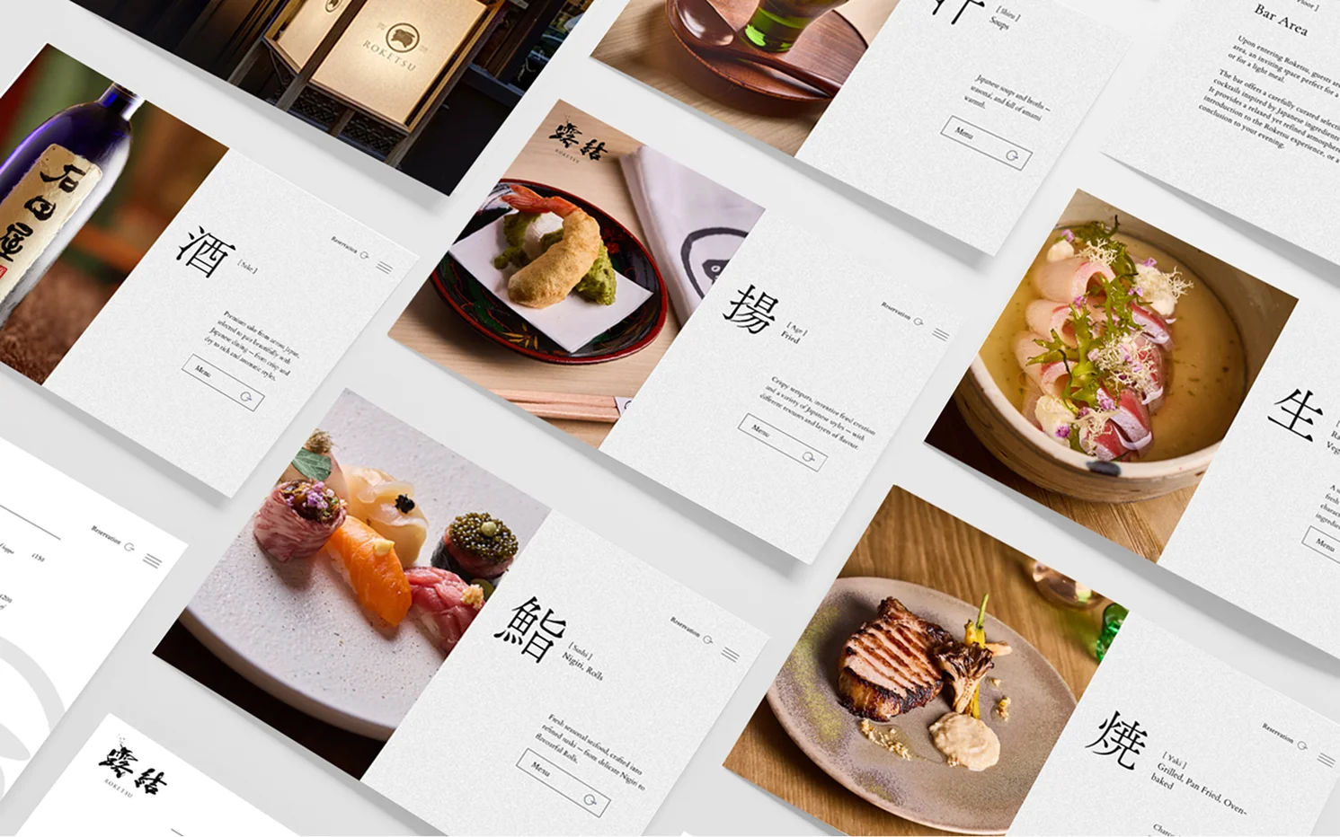
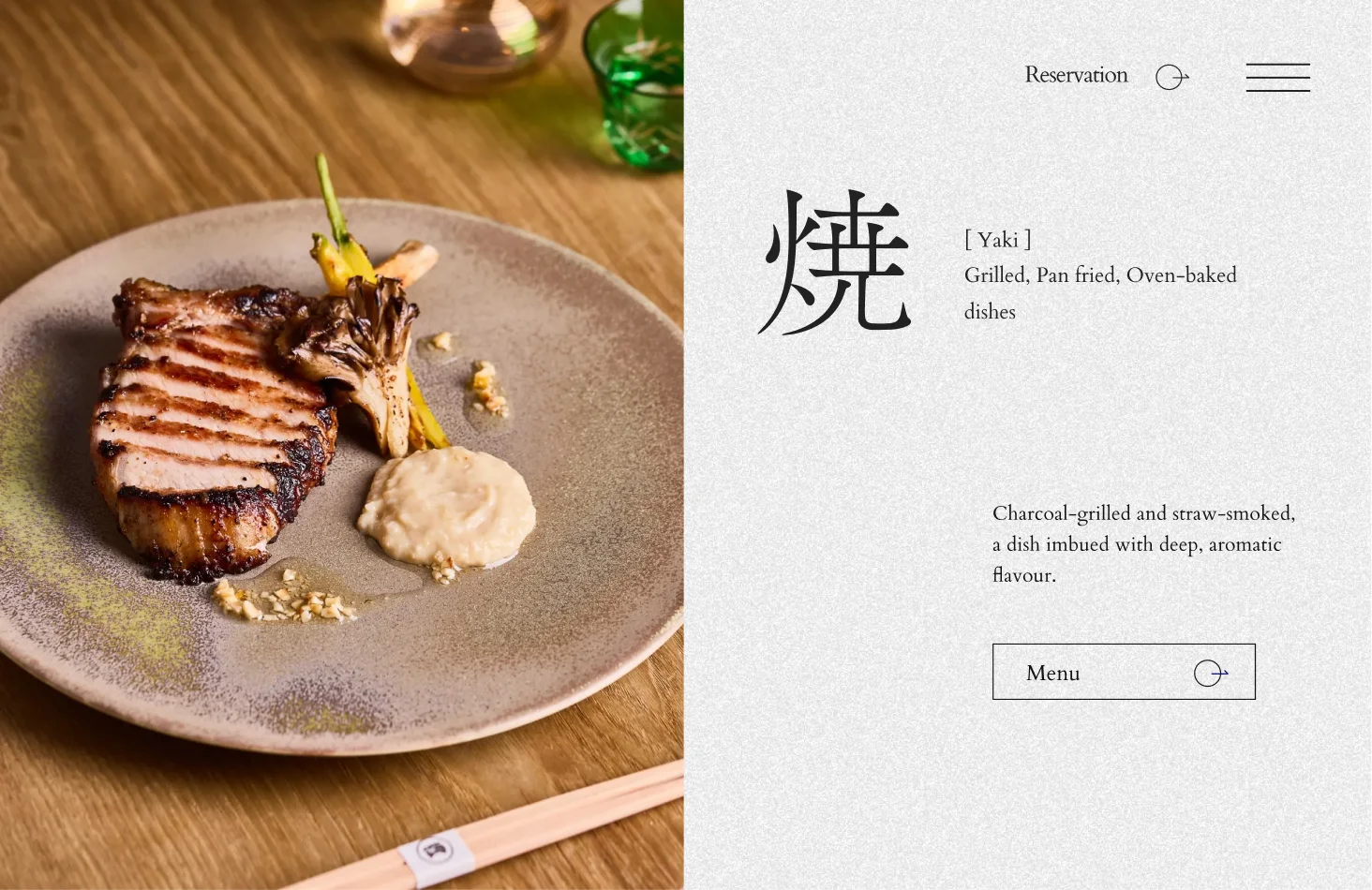
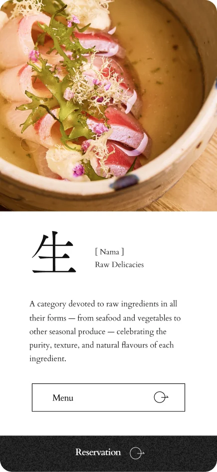
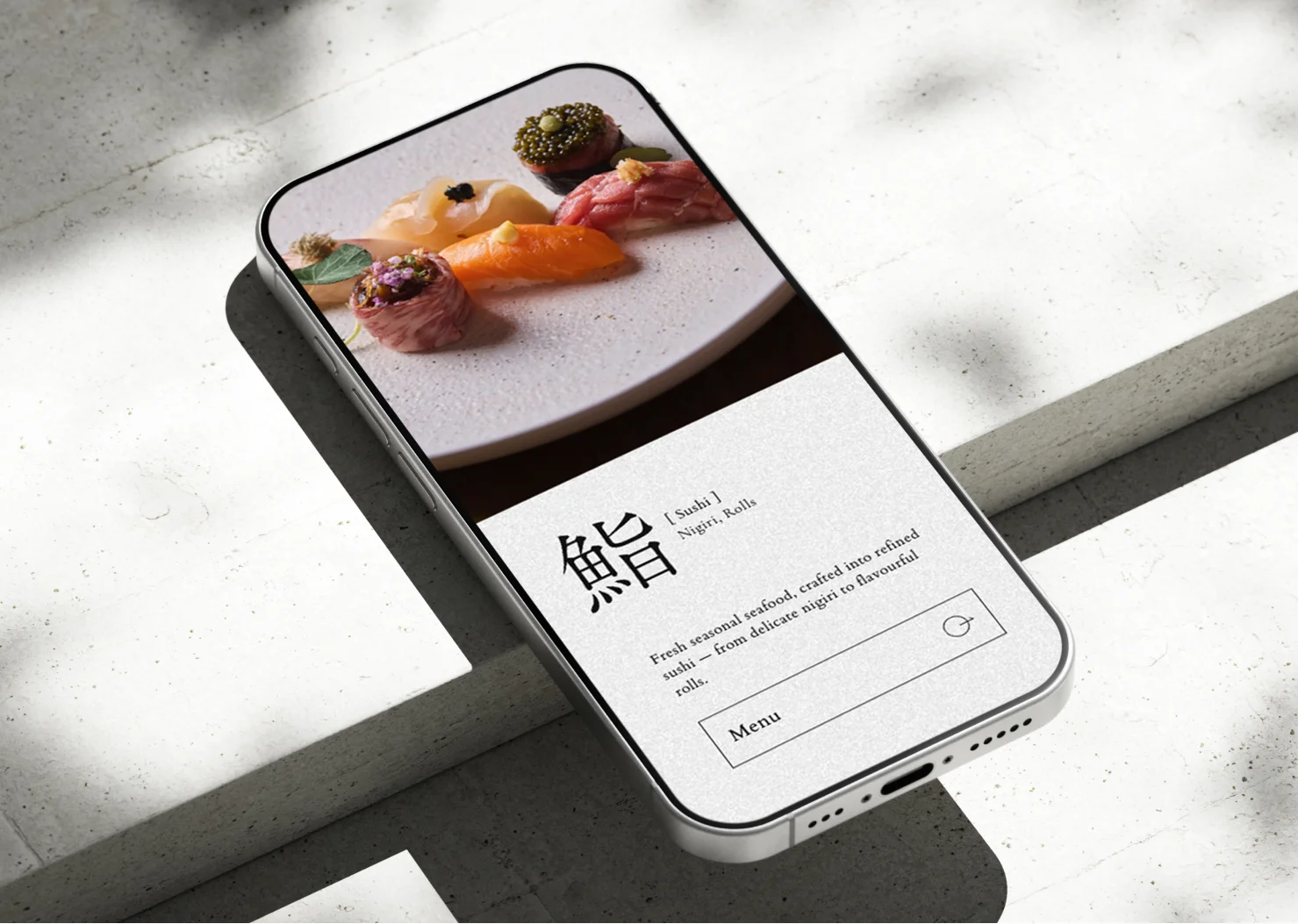
Rather than a fixed-course kappo menu, Roketsu offers Japanese cuisine through à la carte combinations, so the website needed an information structure that communicates that appeal intuitively. To make the experience clear for international guests, we grouped dishes into nine categories: starters, raw, sushi, grilled, fried, soup, dessert, sake, and wine. Each category was organized to highlight its character, with photography paired alongside simple descriptions so users can understand the full menu without decoding complex kappo structures. The result is a menu page that balances the freedom of à la carte dining with the refined beauty of kappo.
UX UI Design
Improving the user experience by optimizing paths to reservations and menus
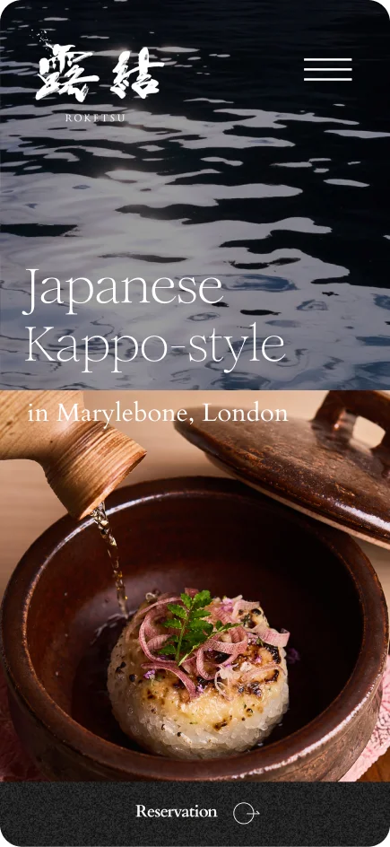
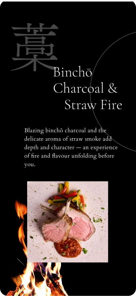
With many tourist visitors in mind, we clearly organized the paths to the menu, reservations, and access information. We designed a simple, intuitive UI so users can reach what they need without friction on mobile. We also shortened the route to the reservation page and refined the user flow to improve booking conversions.
UX UI Design
A CMS for daily menu updates and a print-layout switch
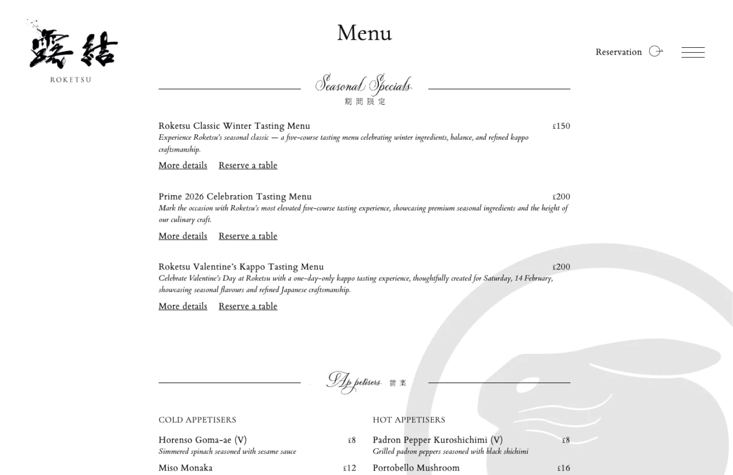
Because the menu changes frequently, we built a dedicated CMS that restaurant staff can update on the spot. Chefs and team members can edit dish names, prices, and descriptions directly, keeping the published menu up to date at all times. We also implemented a switch from the web layout to a print-ready layout, so updated content can be printed for in-house use—an workflow optimized for day-to-day restaurant operations.
Director of Photography
Photography direction that maximizes the appeal of the food and space
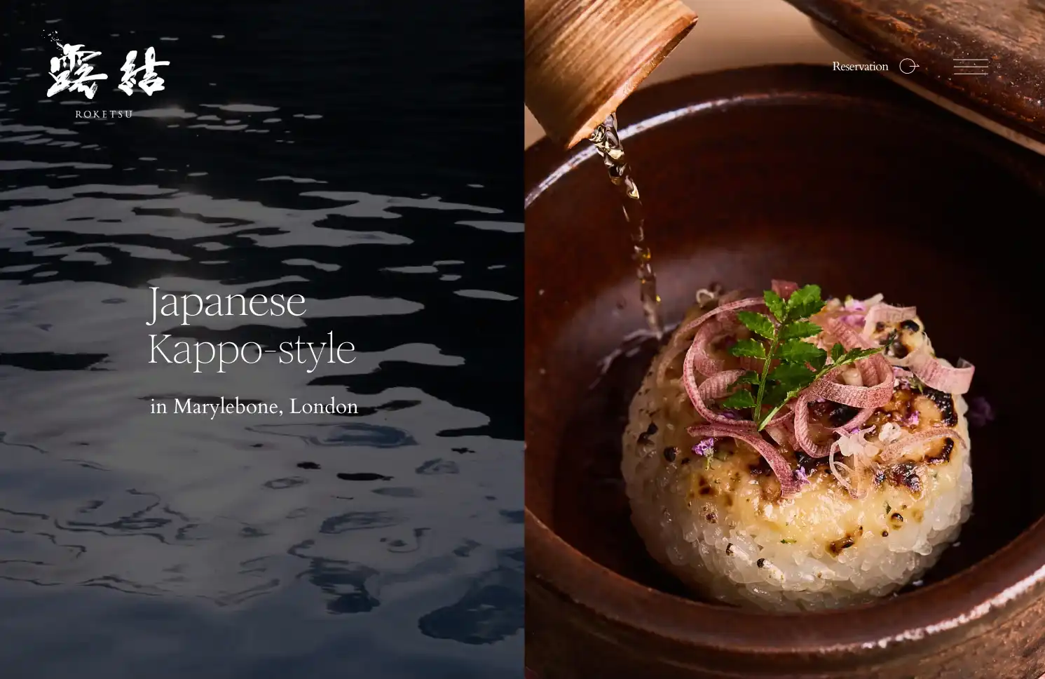
We directed the photography that defines the overall impression of the site, from planning through to production. We selected and arranged a London-based photographer specializing in food photography, and carefully adjusted light, shadow, and angle so the craftsmanship of kappo and the texture of each dish were preserved. Beyond the food itself, we also captured the quiet counter seating and the beauty of the wood interior, creating imagery that lets the experience begin before guests arrive.

SEO Strategy
SEO strategy focused on international users
To increase visibility in London, we analyzed search terms such as "Kappo London," "Japanese dining London," and "Japanese fine dining," and reflected them in the site structure. We optimized the balance of page titles, headings, and body copy so search engines can interpret the content accurately. We also added appropriate alt text to images and improved performance fundamentals to strengthen the site's SEO foundation.

Kens Creative Tech